An area for my personal development!
One of the things I’ve been working on already though out the course has been hand-lettering and calligraphy.
In fact this exercise reminds me of a skill share class called Introduction to Modern Script Calligraphy by Bryn Chernoff she asks you in the warm up to write “welcome to Calligraphy” with different words in mind whimsical, elegant and more.
I’ve also been taking quite a few classes (this exercise was the perfect excuse to finish them!)
I started this weeks ago by collecting fonts for my sketchbook mood board, I really did not know which pair at this stage to pick. So I’ve been having a play with them all really in both my sketchbook and digitally with my new ipad/procreate.
Digital (procreate) version of fonts


I started a pinterest board for this and future references to fonts, picking what I truly inspired me, thinking about the mood that the font alone creates in each one.
Pinterest board – https://www.pinterest.co.uk/clemmiee/oca-text-and-image/
First sketchbook page (with a bit of a moodboard)
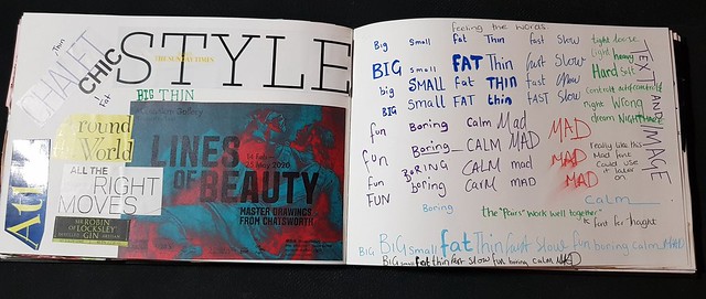
FAT and thin
I picked fat and think as I liked the options of routes could explore this pair.


(Above) exploring in my sketchbook “fat” and “Thin”.
Adobe CC fonts
I love using Adobe Fonts, as the search system is amazing. Such for this task I could easily for example for FAT search for bold, heavy weight, wide fonts to quickly find the fonts I needed.
While searching for fonts, I was originally looking for different fonts (but same family) I came across a few fonts that really suited both fat and thin. I didn’t even think of the same font for both, Graphite and Paganini both stood out to me for “feeling” like both!

I know that the exercise said trace, but my thoughts are that I could push elements of fat and thin on each word to empathize each word.
Hand lettering artist that inspire me…


Most illustrators seem to have an element of hand lettering and have dozens I follow on skillshare that inspire me, however for this the works of Christoper Corr and Jaqueline Bissett. Reason I liked Christoper Corr is the boldness, fearless lettering, the fact the imperfections are the hand letterings own charm. It has a very childlike matter in which he writes, his lettering seems “happy”. Bissett work is just like she wrote a note to herself and it fits perfectly with her illustrations!
The two artist would suit my theme fat and thin perfectly, giving me ideas to merge these into a little illustration of my own!
The result of being inspired by these two artists and my “graphite” font.
I created a little piece in procreate…

Moving on after this side track digital version, I embraced the nature of the exercise and created the fonts using acrylic for the “fat” as wanted a bumpy texture and acrylic ink for the “thin” as wanted a smoother finish, while picking colours I felt suited these two words.

I pushed a little more and had a play digitally, but out of the two the original version (above) I feel is best as it expresses the nature of the words without the bells and whistles. The simple nature of this just “works”.

I used this exercise as a chance to explore fonts and push more, I started thinking more about the little details such as texture.
Maybe I could have pushed this more with another word pairing and used charcoal / something with a more grainy texture… Which could have suited MAD or FAST !
I hope I get the change to explore more hand lettering, as I’ve enjoyed this exercise and would like to have a word which I could really go all out on!.
