Creating a clear visual
I was a little confused by this exercise at first, so while I got clarity on what I needed to I browsed IllusratorsX and in my sketchbook, created thumbnails based on work I loved by Corinna Ice, Tom Banson, Cindy Frohlich.
It’s made an interesting page in my sketchbook!

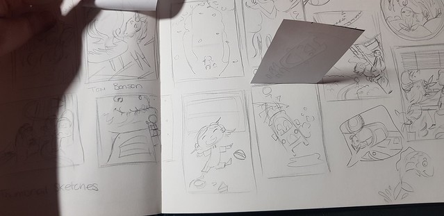
I do like to create basic thumbnails already, but that being said I mainly do this as composition studies, more so when I do not want to be later inspired by the art, I just jot down the basics and see how they have used the visual elements.
These images I really was inspired by the composition and the way they use this to draw the viewer in to their illustration.
This was hard for me as the desire to start simple or with much detail was quite strong so the stages in between the two that I found harder. I think you can see this in my sketchbook I wasn’t in my element. I do however think this is good to explore in my work from this stage onward and start to naturally break an image down and find the middle ground, in other words edit my work better!

I thought may be best to show the “finished” result first so you can get a impression of the image before I show my sketchbook working out on these.
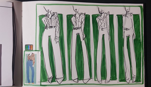
Both images are editorial, in my sketchbook the working outs are two and half size bigger as requested in the brief and these digital version are copies based best visual elements I felt it needed to have!
The first illustration I worked on, I started with a quite detailed sketch in a larger format.
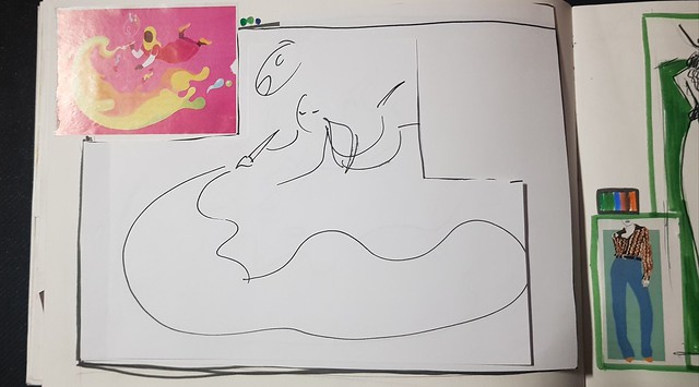
Then on printer paper with a marker, drew less each time, as I wanted to include these in my sketchbook I cut and added them over the first sketch.
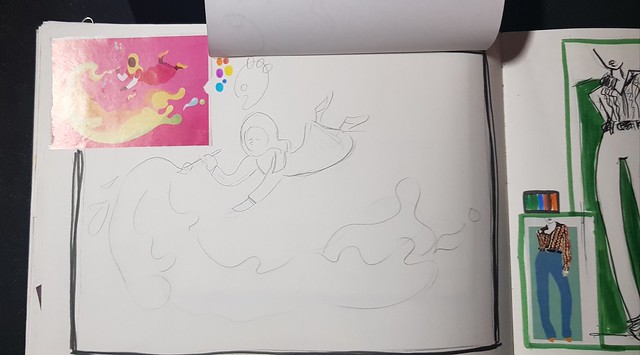

The second I really should have used more visual elements/interest, but this one as you will see below was a good sketchbook exploring page. Thinking best for quickly showing the client more the pose for layout.
This one felt like one of them challenges, when have to draw the same thing in 10mins, 5mins, 1 min and 10 secs.
Then I came to the digital version, I tried to put myself into the mindset of what the client really needed to see, not just what I wanted them to see!
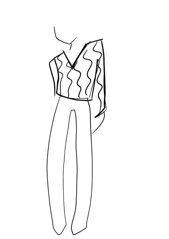
Most important would be things layout and rough idea of visual element placement and if a showcase element (such as the fashion top) to maybe colour/or at least give a decent impression of that within the rough/thumbnail.
I admit wasn’t excited by this exercise as couldn’t really have “fun”. I knew this was a practical exercise that HAD to be done, rightly so as breaking down illustrations made me stop and think what the client would like to see, what they needed to see and what they didn’t need.
Credits, references and resources
http://www.lukewaller.co.uk/blog/2014/11/15/the-art-of-illustration-how-to-manage-a-short-deadline
https://www.webfx.com/blog/web-design/an-illustrators-project-from-start-to-finish/
https://www.evenant.com/design/creating-thumbnail-techniques
http://www.muddycolors.com/2017/12/composition-basics-sketching-thumbnails-2/

One thought on “Client Visuals”