Following on from Assignment Two – Point of sale display
And the feedback received from my tutor

The assignment asked you to respond to a point of sale display brief in which you were asked to illustrate fruit or vegetables associated with summer and autumn. Your designs are good, with the fruit and veg in the corner of images to leave space for the text. The issue is the background colour – it seems like the summer background could be much brighter blue and the Autumn background an earthier brown. As it is they are quite tonally similar and therefore not distinctive enough. Your drawings are good but could probably be given a little digital ‘boost’ in the printing.
I wasn’t happy with the background colour myself and wasn’t sure how to “fix” or make it work. I found changing the tones as advised and with the more digital boost I was getting the right vibe of summer and autumn that the original lacked.

This does feel more right, I added more warmth to the colours in the fruit/berries as well.
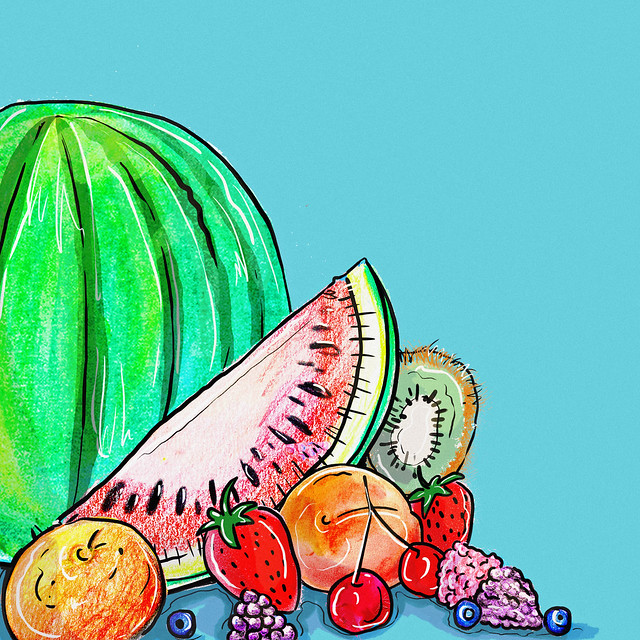
Not only did I make the fruit bolder, I also added more details to the watermelon with an overlay.
The cool/brighter blue does bring the summer feeling to the piece.

This is just a small sample of a possible “text” that could be added. I designed this with the possibility of adding any text to sit the client. In the case of the “sample” text I wanted to show could also use font to enhance the difference of seasons!

One thought on “Assignment 2 – rework”