Bringing all that JAZZ to my work!
I will creating a Jazz night poster.
As always my digital moodboard via pinterest.
My notes / Spider graph
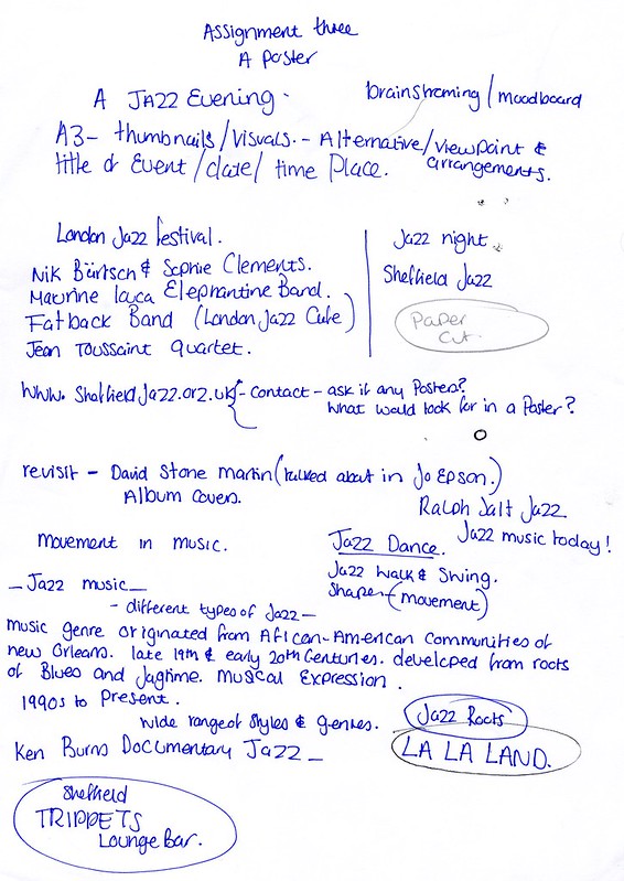

I had many many ideas from the moment I set about this assignment… Maybe too many.
All worthy of investigating, however I wanted to do something “different” so I made a starting point of the best way for me to limit colours was by creating the base of the design based on solid coloured card.
Guess would be sort of like a paper cut with details added!
Another reason for this was I would need a very strong but simple composition to “pull” this together, I had to really commit to my shapes and my viewpoint.

I had already covered an artist that will be another source of inspiration for this piece and that is the work of David Stone Martin.
I had to work out what elements I wanted to use, I think the main thing is colour and maybe the use of lines.
If this works it could be a visually a very strong piece, it should make a statement.
However it is also a risk, there are easier techniques, ones that would give me more room to fix things, edit things. I was willing to take the step outside my comfort zone and pull in the techniques I learnt from the exercises to see if I’m able to create this to the standard I see in my mind.
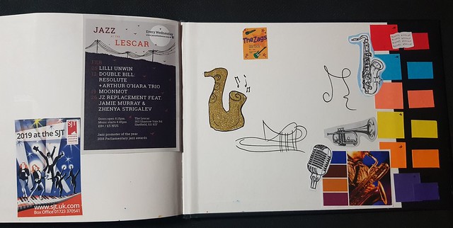
A mini mood board / colour palette page at the back of my sketchbook (I was running out of room)

These pages was created by finding visual elements I liked and front.
Also using techniques I used in abstract I listened to Jazz and created doodles based on the music

Some of my thumbnails as I try to figure out which looks best.
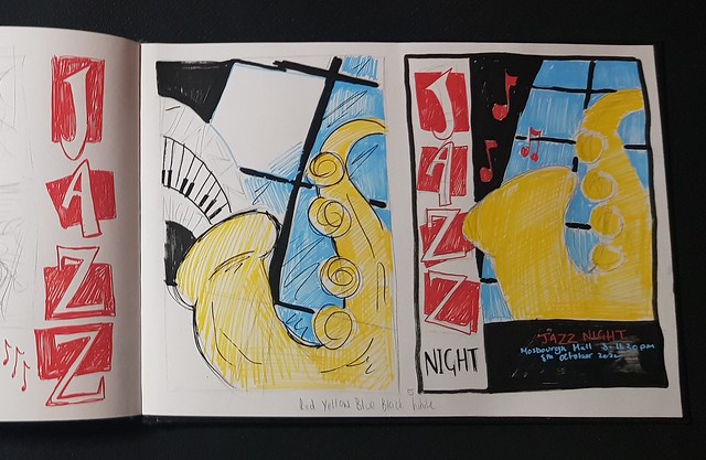
While I really wanted the piano keys, it didn’t match the design so I knew I had to drop.
I liked the font going down, which was an doodle I kind of really liked it so so wanted to see if that element would work.
I really love this mock up, in my eye this is what I wanted, it is very eye catching it is a good layout. and I had taken bits and added other bits to get this and it feels “jazz”
I felt if the finished version does not look right I could always tidy up and recreate this jazz poster from this mock up/rough.

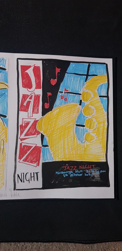
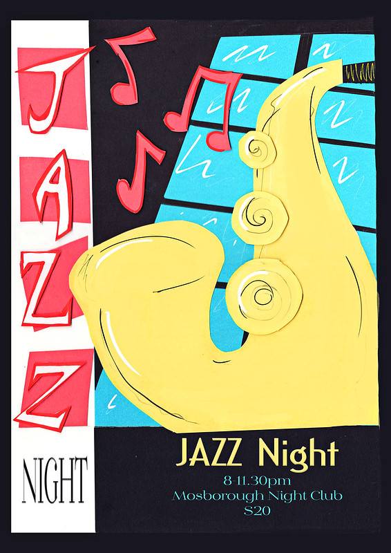
The original on A3
Scanned, edited and small adjustment copy (final)
With font layout sample added.
I originally liked to keep some of the black lines I thought to break up the “solid” colour.
However looking at this it may be making it feel a little messy up close, I want to add a bit of imperfect to it as I wanted that to be a choppy charm.
I think it does pop, which is what I wanted. Just really not sure if to edit some more.
Created a mock up version.
What I liked about what I’ve done is that I’ve used pretty much all part three exercises to create this. I broke the image down and then placed it together!
It has also highlighted some areas for personal growth in terms of skill set (such as typography and hand creating fonts) which I know will come to in part five. I did take the risk wanted to include hand lettering papercut JAZZ in my main assignment when I know handmade “font” isn’t my strong suit (yet), however I felt this was the direction my illustration was going and I wanted a natural paper cut shadow to fall around.
I also had the extra work as a papercut to work with which I do not have much experience within, my wanted to explore the organic shadows that fall in paper cuts to give this piece something more other wise it will fall a bit flat and simple.
I do feel something is a little off with the final above (not sure what and if anything) I have asked fellow student but still awaiting feedback. It’s not like anything I’ve done before so I do not know yet if that is what is throwing me off.
I love the window background (Could have still been inspired by the finding content exercise in part two.) I like the shadows caught from the paper cuts, this is what I wanted and was aiming for.
If was to send of for assessment if I print out the wording I may be able to include/mount the original ?
One of the most disappointing part was losing the original colour of the card, as it wouldn’t scan no matter my adjustment, I’m trying to figure out if I can restore this or it is fine to leave.
What I would do differently, I still really like this idea but maybe finish things like the font to higher standard.
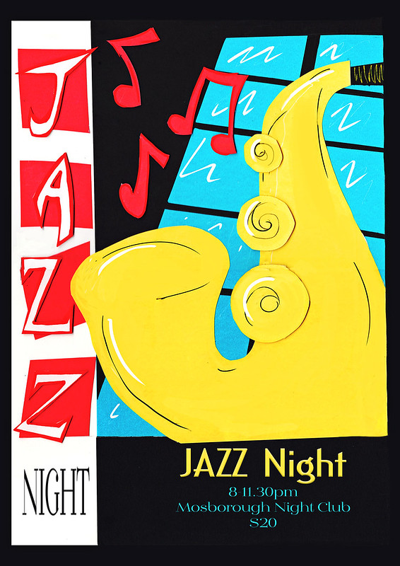
I had to clean up and just tidy the colours so including this image as the final.
Wondering if too bright and lost some the charm that was in the one before…

2 thoughts on “Assignment Three – A Poster”