JAZZ POSTER (Assignment Three)
I loved the idea of adding the details within elements as advised by my tutor so made these changes (plus made sense not to repeat “jazz night”.
New version also includes more hand lettering elements as this is an area I really want to work on and improve.

MUSEUMS POSTERS (Part four)

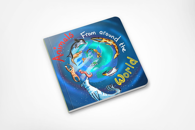
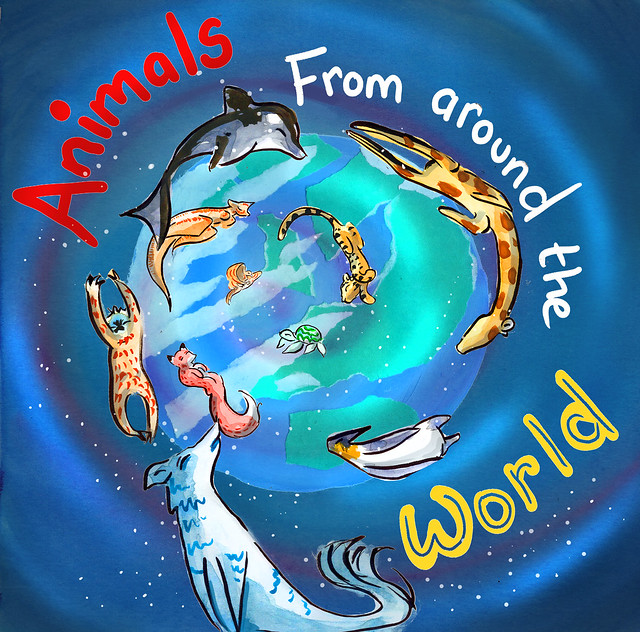
A Children’s book cover (Part four)

I was never 100% happy with this, so when my tutor recommended a globe and making the turtle less like a bowl I jumped at the chance to have another go.
The globe I created to be added, was done with an acrylic base and using a picture of the world over Europe I loosely tore paper to create this effect.
This time I wanted to create a mock up, as I realized working on travel guides as I can feel wrong about my work until I can see it in action.
Magazine Illustration (Assignment Four)
Small edit on advise of my tutor to make the image relate more.
While last one was intention of the article, I realised was to loose and shouldn’t need to explain the context behind the image, as that means the image does not work with the header.
I realise that this is something I will need to take care of more so if I’m trying to do a metaphor kind of image.

A menu
A small edit to include details on the lemon


One thought on “REWORKS part two”