Travel Guides

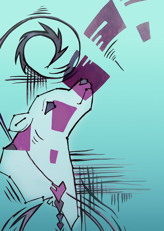
Taking a risk and trying something new!

My brief idea for this one is simple, create a new travel guide look that appeals to the younger, Instagram generation without aliening the current audience.
The client is looking for trailing a new visual style for travel guides and starting with some of the most Instagram worthy cities of Istanbul, Helsinki and Milan.

I’ll admit I’m worried about this exercise, as I need to display more than a “pretty” illustration of landscape (which I would like to do). The client wants many elements and also in a diagrammatic way (not really my strongest area).

After the exercise “giving instructions” I watched a skillshare class Sketchbook Illustration: Draw a Personal, Colorful Travel Map by Mike Lowery while his is a more bolder design which isn’t what I’m aiming for. He did give me an idea to have a map of each location with a very sketchy / wash highlight. I think I would be also best to do the method similar to what I used in “menu” exercise, as the details in the planning would require me to work larger but it need to work in the scale to the book / font.

Size
Travel guides appear to come in all sizes, I took to amazon to do my research and based upon this I found a couple the same size (Lonely Planet) which is 13.3×19.9cm
This alone poses a challenge as I would work better square or landscape to be honest!
Also from my understanding I do not need to just work on the cover, I can twist the design into a full jacket, sort of like John Minton, but with hopefully a diagrammic finish.
With this in mind it give me an area of 26.6 (plus lets say 2cm for spine) x 19cm for the full jacket, this makes it a little more doable in terms of diagrammic design space, although the design need to take into account the spine, blurb and synopsis (so I cannot get too excited by the little extra room)
When I went to the library I could see while many came standard sizes, reality was came in all shapes and sizes. I was going to stick to my choice, mainly as would like to fit in a handbag quite easily and appeal to the clients current market with same sort of size. (although I admit I was tempted to have a square one, as that would indeed make it Instagram worthy)

In the liberty I was able to find guide books for Turkey, Italy and Finland. While each only had a chapter at most on Istanbul, Milan and Helsinki, it will be very useful to pinpoint things guides cover and what landmarks I could research.

I came across this website “Adagio” which is a holiday company for walking (link below) I really like the art style which ink and wash kind of technique.
I haven’t yet been able to pin the artist, just the agency ****

John Lovett

Taking my research outwards I had to tackle a challenge of the colour vs style vs diagrammatic. Lucky I wasn’t short of styles which I can take inspiration from. Such as the works of John Lovett an Australian artist that uses oils, watercolour and mixed media, like the image on the left, its not really about technique that appeals but the way the colour and details are shaped, it gives the impression of a whole image when in reality just key parts. Maybe I could use this around the spine, blurb and synopsis?

Martha Napier

Next I came to the works of Martha Napier, originally was the colour that was of interested me, but she also has given me an idea of a way to bring the diagrammatic way.

Mokhini

Finally the works of Mokhini who would breathe the life into my inspirations for this piece with her bold use of colour and the fun she brings to her pieces.

All three of these illustrators/artist play an important role in helping me find the balance for me piece.

For the first time I understand the desire to travel to a location to truly get the feel for the place, and not just an excuse for a mini holiday. I want to walk on the streets, colour the smell, the vibes, see the way people interact with the cities.

The colours of these cities are just as important of the visuals, that will be what makes each jacket feel different.

The first point of call when comes to colours is to loosely have the countries flag
Italy / milan – Green / white and red (White/cream being the main colour with muted green and red as colour pop)
Turkey / Istanbul – Red and White
Finland / Helsinki – White and Blue
I wasn’t sure how to do this, could be the font or something at first, just I wanted to include in my design. I mostly wanted the vibe of the city to speck loudest in terms of colour. (This I will build up from my moodboard.)

OCA - travel guides moodboard

Pinterest boards
Milan – https://pin.it/1GidvqR
Helsinki – https://pin.it/3irYLBX
Istanbul – https://pin.it/72BoP4A

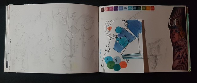
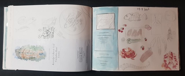
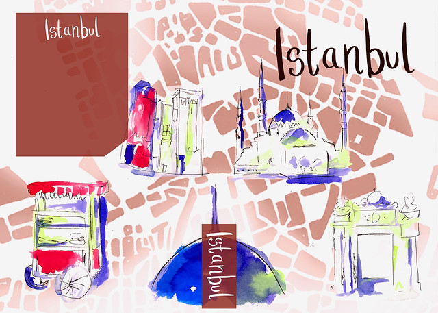
In my sketchbook I sketched roughly key locations of each city, trying to get a feel and vibe for my visual interest. One thing I spotted is each of these cities have a tram, and from that I wanted to include on each cover in the same manner to give the designs a sense of “family”.
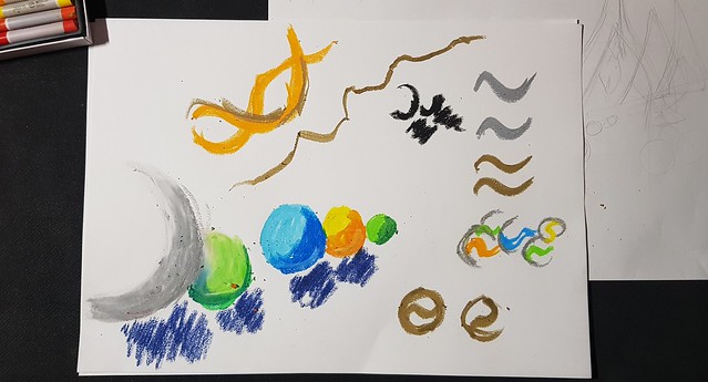
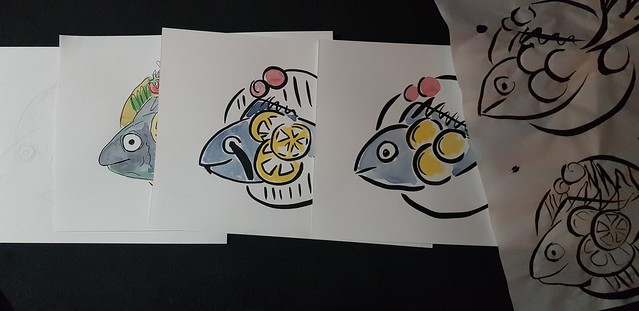
While I wanted this to be a very ink and wash, because of the layering of details I would likely have to create each element individually and build.

In this stage I moved over to printer paper to sketch (as wasn’t working in my sketchbook) I realized later I started to lose my vision, these sketches became much more detailed than I had plans for, which would create a problem with the “look” as will look too busy / too much information in a small space.
Therefore I traced over using the paper I planned to also add wash to, took me a few attempts to get this right.

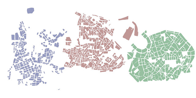
While doing this, I ended up creating the base for the background using procreate (and with the help of maps/google maps)

OCA - Travel Guides Map background
OCA - sketches

Sketches of the landmarks I was aiming to use. As I was planing to experiment with the wash I felt was important to have the ink/sketches in case this goes wrong.

Travel guides background

Basic idea and layout (full jacket) of each design. I admit at this stage I’m not sure if my “vision” will work. This whole thing is a bit of an experiment at this stage!
Line and wash images below.

From this I started putting the designs together, I realized I had to drop some elements (tracks and wave as the tram) as the image became to much and found the design was getting too busy.
These designs are full jackets.

OCA travel guides Helsinki
OCA travel guides Milan
OCA travel guides Istanbul

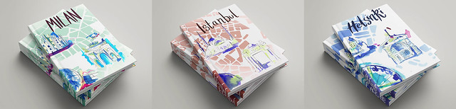
I think these show promise, when I created the mock up for the client “Milan” I could see this working, I could almost see these having a canvas cover. I just to have a diary which had this canvas cover which would be perfect for this.
Milan would be the one I’ll show the client, I wanted to see all three in this format (below)
Guess little thing would need changing, such as Istanbul font and tower line, maybe making the font pop out more on all three.
This was something new and different, I was worried wasn’t looking like anything I had envisioned, but I feel I got the right direction in the end.

OCA travel guide mock up

Credit, research and references
https://vagabondish.com/essential-travel-guides/
http://www.intellimag.net/html5/adagio/2020/adagio-2020.html
https://www.johnlovett.com/gallery


Milan
https://www.introducingmilan.com/
https://www.nomadicmatt.com/travel-guides/italy-travel-tips/milan/
https://www.travelandleisure.com/travel-guide/milan
http://www.travelplan.it/pdf/milan_guide.pdf

Helsinki
https://www.travelandleisure.com/travel-guide/helsinki
https://www.helsinkicard.com

Istanbul
https://www.travelandleisure.com/travel-guide/istanbul
https://istanbulclues.com/istanbul-tourist-map-attractions/
https://promptguides.com/istanbul/downloads/3-day_Istanbul_PromptGuide_v1.0.pdf

Lonely planet – https://www.lonelyplanet.com/

Mock up – with thanks
dailymockup.com
Webthemez.com

Editorial illustration

Sometimes the right idea just takes time!

I had to pick a heading, I was really torn between “how green is your food?”, “the best restaurant in town” and “loves me and love me not”. In the end I picked “how green is your food” as wouldn’t mind limiting the colour palette to just green.

20200331_212013

Since the start of the course I have been collecting Sunday papers, I found they tend to have the best illustrations and normally what is current and trending. With this in mind I thought could create a piece aimed at a “health week” for a summer piece. I created a moodboard with some of the illustrations I’ve collected in my sketchbook, the main piece that I picked as it inspired me and gave me a feeling that I want my own illustrations to give viewers!

20200331_212050
20200331_211935

This was a piece for “International women’s week” titled “escape the gloom of menopause” dark clouds following about to catch up with a women walking away. This was very simple, but effective!

While not quite the setting I would need for my piece the things I could learn from this and take away to apply to my own work. (I ended up using the cloud shape and different colours in my own work)

img348

Early spider graph ideas

something green info
20200331_211814
Early stage doodles – Personal sketchbook
20200331_211833
Drawing green fruit/veg to inspire myself

As normal I created word relation and spider graph, created thumbnails and ideas, my first main two ideas a red apple in field of green apples or a “green” scale for food even a a boy eating fast food but everything a shade of green.
However for the first time my I had a complete design brain freeze!
I was writing the editorial in my mind as a health piece, inspiring for a summer trend of eating green! Making green food fun, something kind of youthful and playful.

20200331_211914

In my sketchbook I had a little toyed with ideas and I thought about an ice cream coloured completely green, from that I thought maybe replace the ice cream with green vegetables and fruit.

20200331_211848

I really liked my main sketchbook sketch, so I scanned in the lines and worked on this in photoshop. I faced a few problems, mainly with colour, what to do with lines and making the contrast right.

I did end up creating this in the way that was most comfortable for myself, digital.
It just felt right for the piece/mood…

oca how green is your food v3
Final design – How green is your food

This exercise took it time to come together, mainly I had a bit of a block due to current affairs of the world. I know in reality you cannot have an artist block as an illustrator as would have deadlines / clients relaying on you. So I did quite a lot of exploring, viewing my past pinterest boards, I just went ahead in my sketchbook exploring ideas and randomly had a thought which I went with. Sometimes I have too many ideas, this started as case nothing inspired me! Once I did catch the idea I went with it.

I do think it would match the piece if a “summer healthy eating vibe” I hope it not too weird that people cannot relate. It very “me” in terms of design and vibe!

Plus I learnt to try to work thought art blocks and the ideas will come!

Your own work

Making my own work go further!

One thing I’ve learnt so far in many studies of other illustrators and artist is that make the most use of your artwork.

Cat Coquillette

The rise of third party print on demand companies such as Redbubble, Society6 and zazzle means you have access to having your work on product and it is easier than ever, but that does not mean we should put art on everything as you still need to be able to understand your market, and find a way to stand out.
Artists and Illustrators go to conventions and sell, t-shirts, books, posters and pins.
I see illustrators like Cat Coquillette travel the world and makes a healthy living using her work as Decorative Illustrations. I first spotted Cat Coquillette on skillshare titled creating a career in illustration – explore print on demand part two of this class is titled creating art to sell, it really does make you start looking at your own work differently.

There are many ways I could make money from my own artworks

Another class I’ve watched is Roadmap to getting your illustration on products by Ann Bollman. Her first two steps “Identity top 3 markets” and “conduct market research” gave me a big idea what I needed to look at and research.

With that in mind I went though my sketchbooks with my post it notes and looked at every image, with a bit of work I could pretty much turn everything into some different purpose. I found surprisingly my top three areas were
1. Greeting card
2. Surface patterns
3. Stationery

So it makes sense for this exercise I focus on decorative illustration, it also would be area I feel would be able to as an artist/illustrator to make the most use out of your art (or is it art re-circling!)

While I was going though my sketchbook I realized that I could use pretty much all of my work in ways I never thought of before! Even sometimes changing something a little means it could appeal more to a whole new market!

img344
Sketchbook page 1
img345
Sketchbook Page 2

(above) as can see I wanted to go down a route if I was an artist/illustrator at a craft fair / convention having things to sell. Things that work well are prints, books and pins, I wanted to look at things that would be cheaper to produce myself and sell for “pocket” money prices. So thinking a bookmark or card using the artwork from my first exercise.
Reason I picked this as it could be an endless format, could target quite wide audience with pets at craft fairs, and I wouldn’t be limited to just a cat, could create the same with rabbit, dog, and mouse! (such as below, sketches in my sketchbook) To have a complete series within this theme.
I really liked the idea of having a bookmark with paws folding over the pages. however it limited me being able to research suppliers as a bespoke design and I could with the right paper and printer produce these myself.

img346

So I looked at getting the card printed with three companies. (below)
I would very likely go with Sixprint as no set up fee and provides a sample at a small cost!

20200329_200327
oca - owb work card v2

(above) I reused the image, I was intending to clean so all lack, however I liked the cut of it, feels more organic. So only edited a little and included some font to give the card propose.
I had plan to get a sample for my portfolio / loose work however due to the current isolation I will not be able to get printed at the moment. So made sure I had my mock up (below)

OCA my own work card mockup

Creating this, I still wanted to make a prototype of my bookmark idea (could work as a bookmark in my sketchbook) So I quickly did this using ink / masking fluid and by cutting to size/shape.
Would need more work, however it looks and work as I intended for this bookmark.
“it would be so cute!”

OCA - Your own work bookmark

I found loads of options for this, I went for what would be realistic in terms of me setting myself up to “sell” my art. I’ve done craft fairs when I painted jute bags, Which was personalized items/orders, which I did okay at, but I’ve found from experience people like to buy little things and maybe place an order for bigger things at a later date.
So can see why prints / pins sell well for artist, that however does limit your audience to “fans”/collectors so I think cards / bookmarks are more likely to sell to wider market. That is my reasoning and my thought behind this.
I think with more polish (on the bookmark) I would have items that I could sell!

I’ve like the research into printing companies / I like to get get value for money without things being “cheap”.

Credits, resources and references
https://mymodernmet.com/how-to-make-money-from-art/
https://millo.co/how-to-make-money-as-an-artist
https://www.artistsandillustrators.co.uk/how-to/marketing-your-art/246/how-to-merchandise-your-art-expert-advice

With thanks to Creativetacos for the card mock up.

Feedback from Part four

Part four has focused on developing your own style and producing work that directly responds to a brief. Overall, your response has been very good. You have demonstrated various stylistic approaches guided by the exercise briefs. Your stronger individual exercises in this part are the ‘Animals’ book cover, the ‘Choosing Content’ portrait, the ‘Fish’ logo and the ‘Character Development’ exercise.

Project: Tools and materials This project asked you to reflect on the use of a particular medium used by illustrators, and to test it out within your own work. Your research is very good here, as is your critical assessment of watercolour and acrylic processes. Your own experiments are all lively drawings with good use of colour. In the watercolour picture the stronger elements that are not repeated in both pictures are the shadows on the arms in your ‘polished’ version and the great blue in the bottle of the ‘loose’ version. The ‘polished’ acrylic image is, as you note, the stronger of the two, although the ‘loose’ version has a good, mad painterly energy.

One of the things I thought doing this exercise was how I liked parts of both methods and thought could be a way to merge these elements. Looking at the images in front of me and I can see the bright blue of the bottle would have worked well in the “polished” version.

Project: Audiences One of the distinctions between fine art image making and illustration is working with an audience in mind. You were asked to produce illustrations to be used as part of a series of poster to publicise a museum to children aged five to nine, teenagers, and a general adult audience. Your ‘Museum Posters’ are very well-researched, with lots of great brainstorming and a confident use of text and design. There are a couple of observations. The middle image is less clear as to what it’s representing; it would be a great retro-Glastonbury Festival poster, but its context relating to the museum isn’t so clear. Perhaps all the posters needed a bit of extra text (like ‘Sheffield Celebrating .. Snowy the Bear!’ or ‘Sheffield Celebrating .. Women of Steel!’ as well as the ‘Museum Posters text. Your hand-drawn font is great, but the ‘Sheffield Celebrating’ doesn’t stand out as much as it could do. Finally, the Women of Steel’ poster would be better if the women had faces, or failing that maybe if the outline of the woman was silver to make them look like steel. Overall, though, the design of all three is very good and really eye-catching.

I was worried about relaying to much on the text and ignoring the illustration so I avoided adding to much, I think and agree adding something like Celebrating snowy the beat etc would give the posters more purpose (used the text mainly as “sample text”) so is a lot of room for improvement. I had originally thought of having the ladies in steel, this idea was dropped to have the colours of all three overlap! that being said there is room to add the steel element in the font of all three which could be carried over to the ladies. I would like to experiment with this, further.
The yellow is my least favorite of the three…

Your ‘Animals’ book cover is, like the ‘Museum Posters’ exercise, very confident with lots of good sketching and use of colour. It does feel like there should be a Planet Earth in the centre of the image, as if the animals are swimming through water towards it or swimming in space towards it. But the style is very good, with a hint of ‘Aquila’ as you say but still in your own style (I think the animal that looks like a green bowl with five wings is an upside-down turtle? A bit hard to read). Overall, though, a dynamic and original design.

I see what you mean regrading the turtle, fresh eyes!
I agree with the planet earth and since have an idea how to go about this. This is another I’m going to work on more.

Your ‘Fish’ menu logo is also very good, although the simple lemon circles lose their ‘lemon- ness’ and the image would read better with the lemon sections filled in as in your Option 1 in the row. Otherwise, a great, simple but clear design that would work well at all scales (menu card up to the side of a van). 

I did wonder about the lemons and feel I still need to work on my too much or too little, I will be adding that back into the design.
I’m proud of this because it is simple and I’ve not overworked it and thought about not what I wanted to do, but what the client needed.

Your tattoo research and observations are good; the whole issue of adopting historical/ religious/mystical imagery is deeply problematic, with the Beckhams getting their spellings or phrases wrong the lightest example. It’s good you’re checking sources and implications. Your tattoo has a strong composition but seems a little visually complex to clearly express the idea of ‘Mum’ or motherhood. It seems to work better as a card as the frame emphasises the composition more than as an ‘open’ design on a body, but it certainly does have the look of a contemporary tattoo.

That was a wonder of mine it wasn’t “mother” enough, I do have a dislike to adding names / words to a tattoo, I like hidden messages and meaning, something I may need to be careful of and take on board the bigger picture.

Project: Visual distortion This exercise followed a process of stylisation by drawing and then collaging an image of a cat or dog. You seemed a little lost with this exercise, as it does go through a number of stages. However, your cat drawings and reduction to wavy lines and shapes are good, and your four small acrylic paintings are lovely. 

You are spot on, I was lost and I felt that!
I think yes with the stages I had to find my own way and make it “my thing” if that makes sense!

Project: Character development You were asked to develop a series characters, producing drawings from different angles, and expressing different emotions and expressions. You chose Mary Lennox and Lucy Pevensie, and develop them very well and distinctively. Your sketchbook work is developing well, and the digital model sheets show consistent body size and language and simple but clear use of line, texture and colour. 

Thank you, as you know character design is an area of interest for me so this feedback is wonderful to hear.

Assignment four gave you the opportunity to show off your developing style and use of tools and materials by responding to a magazine illustration brief in which you focused on a selected theme. Your research, brainstorming and final image are all good, but there is an issue with the basic idea of ‘lost marbles’. It’s not really a common enough saying related to lost childhood, but more an expression about losing one’s mind. Therefore the implication of the image is unclear. It’s a great drawing in terms of composition, style and unusual perspective, but less immediately clear as to what it’s expressing. However, this is overall a strong submission and shows your own personal visual style well.

Yes, I can see this. In my mind it is a play on memories – mind – marbles. Is losing our childhood memories the start of losing parts of our mind ! however like the tattoo exercise the deeper meaning could be lost in translation to the viewer/reader/client. Maybe a subheading or something more would give this clarity that it needs. I will give a bit of thought into things and look at making some chances.

Sketchbooks Your sketchbook work continues to be very good, especially the ‘’Animals’ book cover and ‘Fish’ logo development pages. 
Learning Log Your learning log writing is very clear. You continue to focus more clearly on how you develop ideas, material experimentation and especially your critical reflection. 
Suggested viewing/reading Your artist research is very good, and citing different illustrators for different exercises demonstrates that you’re thinking about the appropriateness of certain visual styles to specific contexts. 

Thank you

Pointers for the next assignment The final assignment invites you to bring together all that you have learnt throughout the course into a range of illustration briefs. Keep continuing to respond to the briefs – your work in this part has shown a very good range of stylistic approaches. It old be great to see more painting like the four small pictures produced in the ‘Visual Distortion’ exercise.

You will indeed be seeing more images painted like visual distortion, due to the first exercise in this part I found myself keen to explore gouache / water colour and acrylic and that means practicing more.

Thank you for the feedback, I will polish up my work more as well over part 3/4.

Part Four – style

Quick links

Exercises
Identifying tools and materials – https://emclemmieoca.home.blog/2020/02/26/identifying-tools-and-materials/
Museum posters – https://emclemmieoca.home.blog/2020/03/02/museum-posters/
A Children’s book cover – https://emclemmieoca.home.blog/2020/03/03/a-childrens-book-cover/
A Menu Card – https://emclemmieoca.home.blog/2020/03/04/a-menu-card/
A Tattoo – https://emclemmieoca.home.blog/2020/03/04/a-tattoo/
Visual Distortion – https://emclemmieoca.home.blog/2020/03/06/visual-distortion/
Character Development – https://emclemmieoca.home.blog/2020/03/06/character-development/

Assignment 4
Magazine Illustration – https://emclemmieoca.home.blog/2020/03/08/assignment-four-magazine-illustration/

I had a couple of up and downs with the part, think I put too much pressure on myself not to overboard with research and stick to the task in hand. I had a few self-doubts moments and ended up second-guessing myself as well.
What I’ve learned myself is to read the objectives carefully, if the client wants visuals and open-minded to give them the range to pick from, give them choices. Put myself more into the client’s shoes and think about what they need not what would make me look good.

Tools and Materials –
This one I enjoyed, I tried to hold back on the research side of things and kept it simple layman terms. Not sure if I held back too much. Being honest I had a lot more I could have easily said and researched. I found it a wonderful exercise to revisit some of my work and explore / redo in a new medium. I also learned some new skills!

Museum Poster –
I was worried I didn’t explore enough as a lot was happening in my head quickly, however, when I look back over my research I’m happy with what I explored and I did pick an interesting subject. My main worry is should I have looked and explored objects/paintings as ended up with my object looking like characters really!
I like the family of posters and quite proud of these pieces, I just hope they “work” for what intended.

A Children’s book cover –
I feel I missed a valuable thumbnail that would have enabled me to hit all the bases, giving the client the range and ended up with two of them very illustrated that it could pass as a storybook and kids will expect that. I wish I did that third option, that being said I like the work I did, and enjoyed it. I knew I was taking a bit of a risk as to the styles I picked rely on the client’s style of writing the education book, which would result in the cover not relating to the interior. I also liked getting feedback on facebook from children and was interesting to get there views!
I thought about changing and giving another sample, however, I may just be second-guessing myself and feel I should trust this enough to get feedback and take from there.

A menu Card –
I feel I was back on track with ensuring the end result would be suitable for the client. I kept simple as knew size to be an issue and dropped a design I liked as was too cartoonish and wouldn’t work small and as a logo.

A tattoo –
I would have this tattoo myself, I wouldn’t have thought to design something like this and was the results of research and getting my first “idea” completely wrong.
I’m thinking the card will need more work (so I’m keen for fresh eyes feedback)

Visual Distortion –
Okay, this is possibly the longest route I’ve taken to get the result, I don’t think I understood at first with what I needed to do and did a couple of false starts, in the end I had to create a way to make it work for me.
I enjoyed the finished result as completely something I would have never created without the help of the collage! While I may not use all the elements there are some bits that I can take forward and maybe reuse (such as the black and white clock palm tree!)

Character Development –
I picked characters from a book, felt there was more challenge in this for me as I love creating my own characters so wanted to give “life” to characters of others!
A risk I took was to create two characters of the same age / 1920s England and late 1940s, I wanted the additional challenge to create another character that could risk looking the same with different hairstyles/clothes to push my own growth forward. In the past I’ve been known for the same face/body to it is something I’m working on.
Only downside of this I didn’t get to create more dynamic character with really “odd” bodies, hoping the course lets me explore more characters in the future.

Assignment Four – Magazine Illustration

Word – Lost
I found the objective of this assignment at first hard to picture. BUT everything I’ve learnt to date helped me to complete this assignment.

While I was finishing of assignment four, I came across a skillshare classed titled Hand Lettering Techniques: 5 Ways to Better Work by Mary Kate Mcdevitt. I picked this class as working on my own hand lettering while doing the course, in this class she covers the importance of self critique, while I can be quite harsh with myself in terms of feedback this class covers a more objective way to look at your work and start to enable you to pin point what “feels wrong”.

For the next part, (part five – words and pictures) I want to ensure I offer a lot more visuals and step up my game for the end result. I feel there are some very challenging exercises coming up and I want to be be able to give it my best.

I also need to start thinking about having the best pieces for assessment and making sure these are at the highest standard (not just “make do”)

Illustration highlights

OCA poster museum mockup
OCA - Tattoo mock up
OCA - Character design mary
OCA - Character design Lucy
Mockups Design

Assignment four – Magazine Illustration

I lost my marbles with this one!

I had started this with a spider-graph and sketchbook page of thing “lost” and things you could “lose”.

20200308_200838

First page of sketchbook – exploring ideas

oca lost sprider graph

I had a theme for my marbles being a symbol of lost childhood memories / dreams that we walk away from.
The reason I’m going for a colourblind colour palette and having marbles in colour as sometimes we lose what made us excited about the world as a child, the world in many ways is more colourful as a child. That being said, I want to add textures to the marbles to possibly could end up not looking so bright in the end.

marble images

Some of my marble photos (cropped and different layouts) – I’m going with the image bang in the middle as I think it stood out the best and liked the trail of marbles.

20200306_113503

Sketches in my sketchbook of different layout and options before adding a character.

OCA - Magazine Illustration moodboard

My digital moodboard (above) for the colour palette, reference to poses that stood out the best and (below) is all the poses in my pinertest board.

20200306_113446

Exploring different techniques in my sketchbook

20200308_200818

Sketches I created of the marbles (these would be the lines I carry forward)

20200308_200802

I explored with tonal using oil pastels, however the page became a mark making page, this was nearly my route I wanted to take. (However I preferred the option of textured pattern card I found in the end) I was also worried about having too much detail in the piece that it would be lost.

My ideas had already started to take shape, I was looking now to polish the design and make it work as a magazine spread, when I was gaining some inspiration I came across two illustrators that would enable to to push my design more.
One being Kali Ciesemier, what appeal to me is how she works her illustration into the page and the text and her work seem to blend together. It got me thinking about my own design and that I should work more around the text. (see below)

Thumbnail – of layouts.

20200306_113409

The second artist I came across is Ichijo Hikaru from Japan (riso print pop art) because I spotted she has the foreshorting images I’m aiming for. I also like the textures she has added.

Both artist influence the image I would end up creating.
I started a new pinterest board for magazine layouts for this assignment and future use and to refer back to.
Guess you could say this point I stopped thinking about my illustration as a box!

digital thumbnails

Digital thumbnails and figuring out the best colour palette (LOST)

OCA Lost

At this stage I thought was best to try and take a step back and with fresh eyes try to review my own work (below)

img331
OCA marble textures

I found these textures in a bath bomb gift box set, origianlly I had planned to use all as a overlay, however I think it no longer fits the mood of the piece. Which that in mind I took the marble and used as an overlay on the original marble colour and I think this works.
So I took different parts so all the “marbles” look different.
I had also taken into account my own feedback (and recommended background colour I asked for which was best on OCA discord server) and made some changes. As I rushed the heading I picked a new font and heading that I felt suited this piece better.
I also added shading and highlight to the marbles.

OCA - Assignment 4 LOST

Final piece, I really liked the final result of the marbles.
I maybe would make the foreshortening more dynamic and the step forward more “pulled” and out of frame. But I’m not sure if that is the perfectest in me as it looks right, and to carry on I could be in danger of overworking.

Mockups Design

Mock up of the final design.

Mockups Design

My worry with this one is if I allowed myself to explore enough at first, I found the ideas naturally and quickly taking shape. I knew some things were not working or going to work so I dropped rather then waste time, so could spend more time polishing this idea.
I also had picked marbles which may have been too simple in terms of skill life. I wanted to use what I’ve learnt and put it together in a simple form. I was using techniques I’ve learnt over the exercises without realizing it. Like I knew I needed crop the image, I needed to keep simple, less detail, I wanted the right texture, I think in this respect I’ve started to streamline the way I work. Less time wasting in what I should be doing and more time in creating the piece and growing my ideas.
I’m also starting to see my work better objectively and from a possible client view.
I think by allowing myself on the exercise “book covers” to make the mistake I seeing a clearer picture.

Credits, reference and research
https://www.digitalartsonline.co.uk/features/illustration/ichijo-hikaru-riso-print-pop-art-is-celebration-of-female-body/
https://www.behance.net/gallery/47948145/Free-magazine-mockup

Character development

Illustrating with character!

I have started creating character moodboards (Sample above of my digital), physical, digitally and on pinterest. (below) Characters really do interest me, I’m going to continue to make mood boards as the list is endless!

Aaron Blaise
I cannot talk about character design without talking about one of the biggest influences in my work and that is Blaise.
Most noticeable work is for disney, he also offers classes/courses on both youtube and his website (which is well worth watching)

A style that I’ve been enjoying of late is that of Netflix The Dragon Prince and Spirit riding free.

I think my first idea is to pick a character and do as if I was creating for for a Netflix kind of show.

Skillshare classes
Character Design Crash Course: Dynamic Design in Four Steps – by melissa Lee

Level Up Your Characters: 5 Techniques for Creating Better Character Designs – Haydon Aube

OCA - Character warm up

Digital warm up sketches (character warm up)
When I feel my characters are looking samey and if need to warm up I find pictures on pinterest and magazine and draw them, trying to take in the character differences and make into something more.

“Any time you design a character for a Disney picture, especially a fairy tale, it’s going to become the definitive design for that character, so you don’t want to hack something out. You need to put in the kind of care it warrants if it’s going to live in history.”

Glen Keane

I will be picking my character from a book, the main reason I’m picking a pre-existing character is that the character has a set personality. I create my own characters all the time for my stories and webtoon so I wanted to do my own version of a character for the first time!

Character One
Mary Lennox – The Secret Garden

Quite possibly the first character other than the “classic” disney princesses I truly loved.
I still own the book secret garden from my childhood, pages worn and yellowing but this book is of great importance to any thing I am as an artist or illustrator today.
Within these pages is an image of Mary, which i loved and this inspired to draw as I wanted to recreate many many times. The secret garden not only inspired me to “draw” but shaped how I do my own characters for things like my future webtoons. I like my characters to be like Mary have a strong character growth arc.

20200224_114222
20200224_114124

I added the red bow as it would be her “thing” when she is mad would look more like mini devil horns.

20200222_202200
digital character sketches

Quick digital sketches / doodles of the other characters

Character Two
Lucy Pevensie

Originally I was going to pick Dickon Sowerby, Marys antithesis in “the secret garden”, however I felt the challenge would be greater if I was to do two children of a similar age, both important characters, but not only look different but their starting personalities different.

For this, Lucy is perfect!
While both Lucy and Mary exhibit a couple of core personality traits such as stubborn, being brave and desire for the truth. Lucy has a childlike innocent, full of love which Mary lacks at first. So the way Lucy will carry herself, her expressions will be very different.
Also the two girls stories mirror each other greatly in many ways, an example of this is relationship they both form with in Lucys case Mr. Tumnus and Marys Ben Weatherstaff / Robin.

I know it is a bit of risk, as characters indeed are of a similar age and gender. This poses more of a personal challenge for me and a serious area of growth. I have been known for the same face syndrome prior and it is something I’m still tickling, more so as I come to do my webtoon. With these characters see the two girls having very different facial expressions, shapes, eyes and so that is the main reason for my choice.

Another reason I think there is an interesting challenge in making “normal” characters without defining features, just how to make them interesting and more dynamic !

20200222_202129

One problem I would face with Lucy is her “thing” as she changes outfits throughout the book and she needs to be recognizable on sight. An option I thought of was to have her to have huge doe like eyes that seem to “peek” at the viewers. Another way long term would be her movements and actions.

I learn a lot about character design following ROSS DRAW on youtube. He talks about a THING that makes a character instantly recognizable!

As I was about to publish this post Ross posted a new video titled “top 5 tips for character design” while a little late for my exercise, I found these had applied to my work anyway.

Digital character designs

Character
Mary

OCA - Character design mary

Character
Lucy

OCA - Character design Lucy

Considering that I really love character designs, I’ve never actually done a character turn around before so that was a new for me. I am pleased with the result and feel they look really cute, most improvement will come with me growing as an illustrator and doing more character designs.
Next time I will explore more with shapes, movements and facial expressions, you can see this self study in my sketchbooks. There is the thought I could have played this exercise too safe, but I feel personally it is harder to create a well rounded “normal” character. If I can create the good foundations of a basic character, then the slope of growth will be better for the rest I will design.

Credits, references and research
https://www.youtube.com/user/AaronBlaiseArt/videos
Disney
Dreamworks
Netflix
Mayan Engelman

Visual distortion

Not just pushing an image visually, I found I really needed to push myself!

I start this exercise with being honest I’m not a fan of using collage of magazine/printouts in my work, I have just started to like creating textures and put them together, but to visually distort using images seem to fail me.

The first part of the objectives of this exercise to with the cat and limiting the lines which I did in my sketchbook (below)
Started with detail and then using a Chinese brush and pen I limited the amount of lines I used.

20200306_113623
Vicky Scott
Eric Carle

Next part I wasn’t sure how to to begin, so I did research into collages and distorting illustrations and characters.

Something like the work of Vicky Scott, sort of a paper cute collage with papers / textures / photos / handmade elements, is something I like.
This is something that inspires me.

Another and very early inspiration is the work of Eric Carle, like many I grew up with his images and reading to my own children.

The visual distortion element I have already in my art, well, I like anime, big eyes and long legs and characters like my little pony which enhances features.

One of the things realized as I was researching this, I’ve been going about collages all wrong. I’ve always made the illustrations to fit the collage not the collage to fit the illustration.
So I took a little step back within my Sketchbook and painting four illustrations in acrylic. I kept these really flat as wanted to play with introducing the college elements as texture. My thoughts behind this is to bring the collage

20200222_202251
20200306_113546

After I started adding textures I felt ready and inspired to get back to the objective of the exercise.

“Surrealism is destructive, but it destroys only what is considers to be shackles limited our vision”

Salvador Dali
20200223_130819

Using a huge pile of magazine cuttings and sticking to a subject I love, portraits. I went ahead and created the “character” first and I really strongly disliked what I did create, do not get more wrong I had fun, it had no sense of propose other than me sticking things on to look “pretty” trying to create something surreal without any real feeling / reason behind it.

I so put together a pinterest board (below) to see what I what liked and what I was trying to aim for, I was going to leave as that and just draw this and accept that other than adding textures, collage are not really my thing. However, I found I was actually very annoyed at myself as I promised I was going to be open-minded !

Could it be I just be I like the control and my own imagination over than being “random”.
It reminds me of something I keep saying to myself over and over “Don’t get to attached to an image in the early stages”!
OR that I really do not understand and have no “feelings” for what I’m creating.

20200223_212332

From the pinterest board I one of the things I knew one was an huge issue itself was the background was just too dark, after a break from the piece and debating to start again, I wanted to see this though. So re-cutting the design, removing elements and adding new visual interest I think I was able to create something more along the lines of likable.

I also gave it a story around the theme “time”, the beauty of time passing, I could have pushed this more maybe, but I was happy at this stage.

I found a lovely little page online called 21 brilliant collage tips from top illustrators by digitalart online. This reassured me a lot, and this exercise wasn’t too bad it was just me trying to find my thing / footing and I didn’t quite “hate” creating collage after all!

I used Photoshop’s tools and filters to adjust saturation, colour balance, contrast and lightning to help finish the piece.

Valentina Brostean – DigitalArt online

I realized I also didn’t even think about edit the image digitally, it never crossed my mind to make the image work like this for me, seem indeed, I have a lot to learn!
It would also a method to have more “control” while being random!

With this in mind, I will be scanning in my magazine pictures and creating my background, land, world in the theme of “time”.
With the limitations of size, colour really lifted would I be able to combat this exercise fully and have something I could create a full illustration by the end.

OCA - visual distortion 001

Scanned and cleaned up digitally
Collage (portrait and character final)
I feel the inspiration for this character, some kind of character that can control time.

OCA - visual distortion 002

After scanning in pages upon pages of magazine images (which I have a resource folder for now) I added things together to create my world of “forgotten time”.

OCA - visual distortion 003

this is turning into “mistress of time” theme.

Digital sketch of my collage (left), I ended up doing this digitally, just purely due to having photoshop open and it give me the freedom to explore.

OCA - Visual distortion 005

Merging the two colleges together as a drawing….
I first had the character reaching out to to maybe ask the “reader” to join them in this world, but I felt the pose was stiff, she seems lost on the page when she really inspired my work direction.
This was a good tonal study and found it useful for the next stage to start this way.

OCA - Visual Distortion 007

The final
Digital inspired by the two collages I created.
I Moved the character to the foreground as she was lost in the image before and after creating the collage I felt this world of time has been designed around her so needed her as a main element.

I’m aware that I wasted time, but I feel I had to do this in order for this exercise to find purpose in my future work. I had to find how I can make this work for me and explore that. As I did like the idea I could create worlds / new characters in this method but I needed to be able “control” the size / colour. (not a lot, just a little)

This exercise started by creating a huge of a conflict withing myself, with both my desire for control and yet wanting to fully explore. I knew collages are not my “strong” point and to top it of I do not always value complete surrealism within my own work. Out of all the exercises that pushed me out of my comfort zone, none has done so like this. It was also a HUGE eye opener in terms of collage genre of illustrations, that most likely boiled down to I didn’t really understand.

I started this exercise with next to no interest in college and surrealism it creates, by the end of this exercise It has been interesting and wanting to explore it within my own work. I may have taken the long route via collage itself as an illustration before tackling the objectives of the exercise because I felt my own mindset was holding me back and that was something I needed to overcome.

In the end I created something I liked, and would have never created otherwise. I guess this technique would be very useful for creating worlds and characters that I cannot picture in my head.

Credits, research and references
https://www.digitalartsonline.co.uk/
https://www.format.com/magazine/galleries/art/best-collage-artists-portfolio-inspiration
http://blog.directoryofillustration.com/top-15-collage-illustrations-directory-of-illustration-artists/
https://thedesignest.net/everythig-to-design-digital-collage-illustratons/
https://www.shutterstock.com/blog/darrel-rees-on-how-to-create-powerful-collages

A Tattoo

Designing with a client in mind and his mum!

A quick note before starting this learning log.
An important lesson was learnt during this exercise, that you need to be careful within illustrations, I had a direction I was going within Norse and Viking mythology, runes and mother symbols. While I did a lot of research and started designing, I will not be showing this as I came to a conclusion that while the design direction was its own, it had serious and close links to hate / banned symbolism and I wasn’t comfortable continuing with the design and its area after I made the connection. It could be used today in the manner the design really wasn’t intended, more so that could be tattooed on a persons body with ill intentions!

AND I had started this exercise on another very serious mistake, I was forgetting the visual side of this design, I was very intent on creating something different and something with strong symbolic purpose to “mother” that I was blinded by it a little.
Reality I would ask more questions from the client so I would be able to create something special that relates to them.

I still need to work on the balance between objectives / visuals and client.

I thought about designing a tattoo based on an ancient Egypt design based on the mother goddess Mut or the goddess Iris.
I wasn’t pulling together any designs that really inspired me.

Then I had found a tattooist when I was creating my mood page in my sketchbook called Marta Lipinski of dead Romanoff (Leipzig, Germany.) first I had was drawn her images as felt was inspiring, later realizing her interview in “skin Deep” was titled “A mother’s eyes” how mother hood has changed her designs, this was fate!
She had done a couple of designs with birds, so I thought may be able to link mothers/love/family with some kind of birds, while I researching this direction I turned to the thoughts of bears. Not only is the animal symbolism for motherhood, I often myself say I will go into mother bear mode.
I was still inspired by Lipinski designs so will try to link bears to this style as well as my own little thing.

20200224_114317
A moodboard / inspiration page in my sketchbook

Background into animal spirits

I discovered the origins of animal spirits come form both ancient Animistic and Totemistic beliefs.

Totemistic belief is our spirits are connected to the an animal.
Such belief is held Native Americans – Animal guides (Totemic)

Bear guide meaning – Industrious, instinctive, healing, power, sovereignty, guardian of the world, watcher, courage, will power, self-preservation, introspection, and great strength.

Animistic is that all animals and plants have spirits.
Animal Spirit – Pagan (Animistic)

I finally found my creative inspiration with this piece!

img292
img293

As I’ve picked Native American as my main source of inspiration and research, My research based heavily within the warrior culture and how native Americas tattoos influenced the world of tattoos today.
I found the subject very interesting as not only given insight and inspiration for this exercise for my own personal projects such as my webtoon.

20200224_114259

It was important to get the colours right as my plan to use wisely. I wanted meaning in the colours (plan 2/3 max)
Wanted the colours feel like “mother” without the overload of pink tones, so I looked into the meanings to help me come up with a palette.
Steel grey – Reliability, Dependability, fair-mindedness
Power blue – Ethereal, Serenity, Peacefulness
Rainforest Green – Stability, fertility, healing, caring
Juniper (Blue-green) – Protection, powerful, listening, compassion, understanding, kindness, peace, insight, knowledge.
Elephant grey – calming, security, balance, gentle
Peacock Blue – beauty, pride, renewal, rebirth, protection, insight,
Vermilion – life, loyalty, life-giving, strength
Delft Blue – inviting, peaceful, loving, trust, serenity
Moss green – stability, safety, life

I checked colour palette for tattoo ink to see what could match up and work a colour, I found out that skin tone and undertone was important for making colours pop/last.
I think I’m going down the green/blue hue as it is also the middle ground for mid tones along with white/black. Also like any ink pigment a tattoo artist can mix so I would not really be limited by colours in the design.

20200222_201939
Inked copy of the “final design”

After sketching out in pencil I inked one of my designs, I had planned to scan / colour / fix digitally however I realized that the line weight need more flow for this to feel right.

20200222_202005

With a brush I recreated the design so have more weight, more dynamic within the lines.
Any mistakes and I can fix via photoshop so I let myself just paint with flow and feelings.

I also changed my mind on colour, now wanting to link better to native American colour tone and making the design work for a mothers day card. I added elements of native American designs into the lines, even the bottom of the design is a play on a “dream catcher”.

I was relaxed with the colour in the end as I know the client can always change mind and ask the tattooist for a different colour, I feel the design can be flexible with colour and growth, such the tattoo can grow bigger if the client wants and easily add design that work together around the design.

OCA Tattoo design

Final design
Ink & cleaned / adjustment in photoshop

Mock ups below to see how designs work on the human body.

tattoo design mock up

Photo by Lucas Ribeiro from Pexels

OCA - Tattoo mock up

Photo by Scorpio Creative on Unsplash front
Photo by Cihan Soysakal on Unsplash (beach back)

OCA - Mothersday card

Next I worked on the card, the greeting card while the tattoo was designed in mind of working as a card as well, the card is secondary as the tattoo is permanent.

OCA motherdays card mockup

I love the tattoo design, it is something I would have. I would have liked to have an idea of the client taste in the objectives as they may not align with my own. However I think it works very well as a tattoo and quite proud of myself.

I’m not sure about the card design, the idea is there but I feel it needs something more or different as it’s not 100% working for me.
Maybe experiment with different feelings/vibes – such as a vintage/soft or even a wood carving, like the design has been carved/burnt into wood !

20200303_133148

Another thing you can do with this design, is that you can design a series around the spirit animals.
Such as these quickly done in my personal sketchbook of a wolf and eagle.

Credit, references and research
https://tatring.com/tattoo-ideas-meanings/Bird-Tattoos-Interpreted-What-Various-Birds-Mean-Represent
https://customtattoodesign.ca/blog/animal-tattoo-meanings/
https://en.wikipedia.org/wiki/Tattoo_ink
https://lonerwolf.com/spirit-animal-origin/

History of Tattoos
https://newsmaven.io/indiancountrytoday/archive/how-native-american-tattoos-influenced-the-body-art-industry-qRFk_h5xNkOCeMhIsx-w0g
https://www.smithsonianmag.com/history/tattoos-144038580/
http://indians.org/articles/native-american-tattoos.html
http://www.historyoftattoos.net/
https://interestingengineering.com/the-very-long-and-fascinating-history-of-tattoos

https://www.behance.net/gallery/37215557/Free-PSD-Greeting-Card-Mockup

A menu card

Making a small impact!

One of the artist I found when I was researching for point of sale inspiration was Camilla Perkins, I liked the colours she use and how simple the design were (which could easily double up as a logo design.
Her illustrations reminded me of John Mintons book jacket for

In my research I created a mood board in my sketchbook, I came across an illustration for Kerridge’s bar & grill by Quentin Blake which conveyed the vibe I wanted to try. (Image in my sketchbook moodboard as seen bewloq) I will be aiming for a design in the style of the Perkins and Minton with the medium/technique style fusion of Blake.

I have a challenge to make the “food” look appealing and something that would also possibility work as a logo.

In my pininterest board for this exercise I tried to keep in mind what the “client” is looking for and the vibe of the place. This included looking into decor of a possible restaurant and plating of fish.

I knew this will be a challenge to tackle modern and yet making the food look visually appraising, early thought are limiting colours but having the “fresh” colour palette there. So I need to experiment quite a bit with this exercise.

I also have to bear in mind the final size is pretty small, which means even if do create something visually food appealing I need to be able to make it more simple, I could work backwards from a illustration like the exercise client visuals.

20200224_114335
20200222_201804

I first started with watercolour and ink (normal brush) but realizing I could use more line weight. I switched to rice paper / Chinese brushes.

OCA - Menu

(above) viewing these in small size made me select the ones that stood out the best small. As much as I liked number two I knew this isn’t going to work small sized, number four is the one I thought would work best, however looking at it smaller the details are making it too busy and it looks too cartoon for what we want. Learnt my lesson from the last exercise I needed to look at this more objectively!
I’m thinking number three or five, more simple than I thought but these two look the best smaller. Number five works well in black and white, I would like to explore that with a tiny amount of colour under.

OCA - munu Black and white
oca - menu large

Above finals (option for B&W and colour)

OCA to size - menu

After the last exercise I wanted to make sure I kept the objectives in mind, knowing that needed to work on such small scale I had to keep this simple and work with line weight.
Also have the option to have in black and white or simple colours, I also was safe and went with fish as it spoke the best for me being simple and right to the point.

I would have liked the design with watercolour under for the colour, however I think so small it wouldn’t really make a difference.
Most important it works small and could easily be a logo.

Design a site like this with WordPress.com
Get started